

For Grand
A mobile app that aims to help grandparents learn about their grandchildren's interests. The app features a variety of foods and activities, sorted into general categories, with information about each item. The user can also filter results based on information about specific grandchildren.
Role
- UI/UX Designer
- Prototype Developer
- Researcher
Team
- Amy Liang – UI/UX Developer, Prototype Developer, Researcher
- Keerat Mahil – UI/UX Developer, Prototype Developer, Researcher
Tools
- Figma
- ProtoPie
- Autodesk Sketchbook
Context
Final project for Interface Design course at SFU, October – December 2022.
The purpose of this project was to design and prototype a fictional app targeted toward seniors. My team chose to create an entirely new and original app.
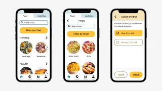
Final Design
Process
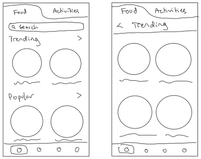
Ideation & Sketching
My team decided on the idea for our app after doing some research on the target user group and brainstorming. After agreeing on the concept, we each sketched out ideas for the core function's interface. We then worked together on a call to decide on a “final” sketch to continue with and present for feedback, including features such as individual food and activity items, the categories they would be sorted in, and a filter to find results suited for a specific child.
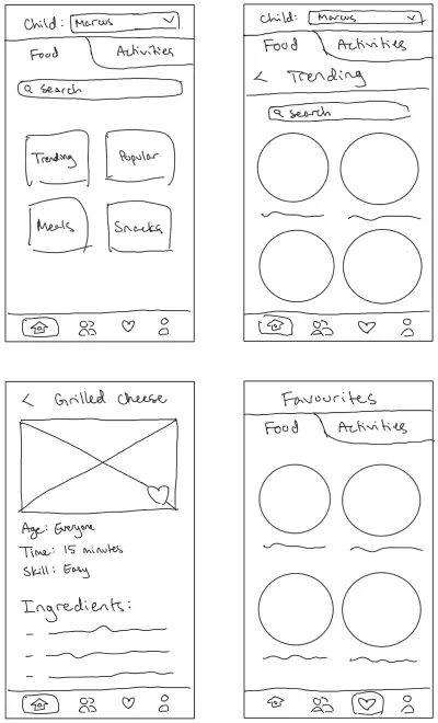
Mockups & Colour
After receiving feedback from the TA on the sketches we made, we made some changes to the design and decided what the other main pages on the navigation bar would be. There are a Community page, where users could make and view posts about what their grandchildren enjoy; a Family page, where the users could add and view information about their grandchildren; and an Account page, where users could change their settings and view their favourited items.
We then made high-fidelity mockups of some of the app's pages using Figma, and I was responsible for the home page and its subpages, which are used for the app's main function. We decided to use blue and/or yellow to give off a feeling of happiness, and I created various versions of the same layout to explore different colour palettes and decide which one we thought worked best.
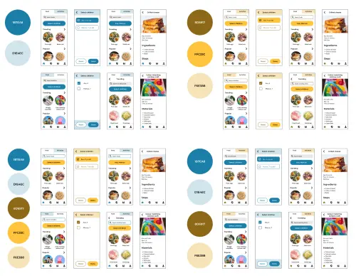
We decided to use the blue and yellow colour palette at the bottom left of the image above. Through research, we learned that users of the target audience may see blue as more faded, and chose to use yellow for the buttons to make them stand out more.
Prototyping
For the next stage, we expanded on our mockups and imported them into ProtoPie to make a working interactive prototype. Each member of our team prototyped the pages they made mockups for, so my role was to make the prototype for the home page, its subpages, and main functions.
After receiving feedback on our first prototype, I added buttons to the horizontal scrolls on the home page to give users the option to scroll by tapping, in case of dexterity issues.
Here we also faced the challenge of finding a way for information about the grandchildren's preferences to be added by other family members, such as the parents. After some thinking and discussion, we decided to have an external webpage where anyone with the link, which can be copied from the app, could add the information. I added this feature in the prototype of the app.
Usability Tests
When the time came to conduct usability tests with user participants, we planned out the testing procedure to focus on ease of completing specific tasks. We decided to time how long the users took to complete the tasks and take notes on qualitative observations, then interview them at the end. I conducted the study with three participants by sending them the link to the prototype and completing the testing procedure with them.
Based on the insight we gained from the usability study, we implemented changes to resolve common issues. The changes I made to the home page and its related pages included changing the label on the filter button to make it easier to identify and understand, adding a description on the filter page to help the user understand the feature, and moving the favourite icon on the item page to be below the image of the item to make it more noticeable.
Reflection
Working on this project was a valuable experience, as it provided me with experience in user research, creating mockups, and prototyping. Through this project, I have gained a deeper understanding of testing and interviewing with users, especially in designing usability test procedures and analyzing data to improve existing designs.
Something I would do differently is to ensure that all of the different pages in the app maintained a more consistent and cohesive design before starting the prototype. As my team split the work based on the app's main pages, the visual design of each page was almost entirely created by a single person, and as a result some of the pages do not match very well with each other, visually and emotionally.